Sep 11, 2026 by Michael Sjoberg
Redesigning the title bar
I am not happy with the current look and feel of the title bar.
The traditional approach is to have the title bar separated from the tab list, with the tabs directly below it. Some applications, such as browsers, instead put the tabs in the title bar. Others use a vertical tab list.
I'm still not sure which approach I like for Koi.
Until now, Koi has used a fully custom title bar with the native traffic lights injected into it (b209 and earlier). This makes it possible to do basically anything with the reserved title bar area.
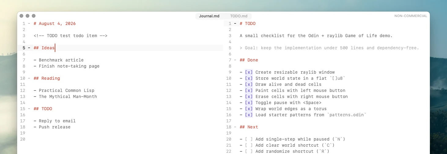
The tab list is centered and shows all open files, with custom styling when selecting multiple tabs. Adjacent selected tabs can be visually joined together.
A native AppKit title bar is tempting because it makes Koi behave more like a native Mac application. AppKit handles the traffic lights, the file controls with the path to the file available as a drop-down, and native drag-and-drop behavior from the file icon.
However, the native title bar is not necessarily a great match for an otherwise custom-styled application.
There are settings for changing the background and appearance, but native title-bar materials blend with the window background differently from the rest of Koi. The result is a slightly darker shade in the title bar.
The title bar can also be made unified and transparent, but that introduced another problem: normal window dragging would only trigger in a small strip around the vertical center of the title bar.
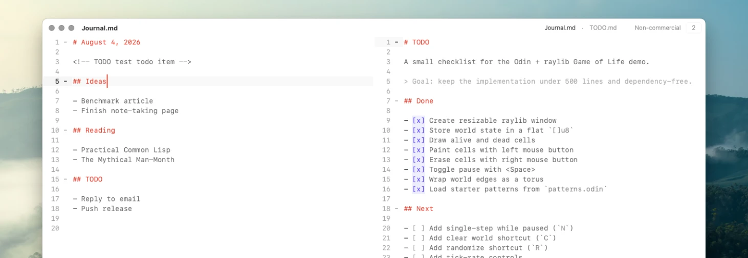
I'm currently trying a hybrid AppKit approach (b210 and later). It keeps the native title bar and its file controls, while using custom controls for editor-specific features. There's still a little non-native plumbing involved to preserve normal window dragging and resizing.
This also changes how tabs work.
There's no longer an always-visible tab list when working in a single file. When multiple tabs are selected, a smaller tab list appears showing only the currently selected tabs. That's it for the persistent tab UI.
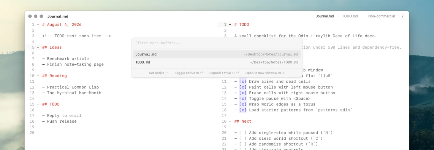
The full list of open files now lives in the Buffer Explorer, which effectively works as a vertical tab list.
I think this might be a good design. Or maybe not? I guess we'll have to see.
The one thing I might miss from the custom title bar is the ability to tear off a tab into its own window and drag tabs between windows. I think that worked very well.
The equivalent now is to first open a new window, then drag the file icon into the new window. Instead of moving the tab from one window to another, this opens another view of the same document in the new window.
Documents in Koi are shared across the entire application, so edits made in either window are immediately reflected in the other. I think this fits Koi's all-files-are-synced-across-windows philosophy quite well.
I will eventually look into merging some of these dialogs into a more Telescope-like picker. The Buffer Explorer, File Explorer, and Command Palette already work in a similar way, with filtering and keyboard navigation, but currently use separate widgets and slightly different list layouts. They could eventually share the same dialog and result styling, with only the underlying data source changing.
I'm also looking into other ways to provide quick mouse access to all open files without keeping a tab list permanently visible.
If you've seen an application solve this in an interesting way, feel free to send me ideas.